Logo Eliophot
open-burger

IECH

Laying the foundations for a new brand identity

The brand

IECH

Services

Branding, logo, naming

Need a logo or a graphic charter?

Contact us
Château-min

Background and brief

IECH, family group

IECH, a historic family-owned hotel group in France, recently acquired several establishments. In order to differentiate its profit units (hotels and restaurants), the group sought our expertise to define distinct brand identities for each of its establishments, thereby clarifying their positioning and optimizing their appeal.

To do this, we first conducted an on-site audit to analyze the strengths and weaknesses of these establishments, as well as those of competitors.

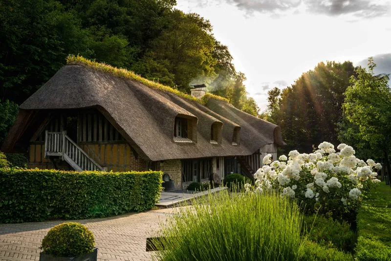
La Tortinière is an estate on the banks of the Loire, near Tours. The estate and its hotel are firmly rooted, but its restaurant suffers from a lack of identity.

We wanted, through a new name, to anchor the restaurant in its universe, independently of the hotel and the estate.

Creating an identity and a sense of belonging are essential to win the loyalty of local and visiting customers.

Background and brief

Branding

Aurore Branding

NAMING


La Tortinière is an estate on the banks of the Loire, near Tours. The estate and its hotel are well established, but its restaurant suffers from a lack of identity. We wanted to use a new name to anchor the restaurant in its own world, independently of the hotel and the estate. Creating an identity and a sense of belonging are essential to win the loyalty of local and visiting customers.


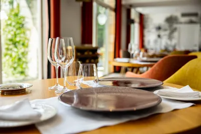
“Aurore” was finally chosen as the name. The name is evocative of light, and makes full reference to the restaurant’s large bay windows that bathe it in natural light.


Aurore is one of the first names of the author George Sand. She was the aunt of Pauline Dalloz, who had the Château de La Tortinière built in 1866.


ARTISTIC DIRECTION


In order to take a global approach and achieve greater coherence, this name is accompanied by a new hand-written typographic logo. Like a signature, the handwriting is elegant, fluid and feminine, to better reflect the story behind Aurore. The logo also conveys important values such as accessibility and authenticity.

<p>Logo Aurore</p>

Branding Novotel Le Havre

NAMING


IECH asked us to come up with a new brand identity for the restaurant at the Novotel Le Havre hotel, with the aim of increasing the number of visitors.

The choice fell on “Les 4 vents”. Located close to the station, the Novotel and therefore the Les 4 vents restaurant are places where people pass through and meet. Halfway between the station and the port, it’s a place where the winds meet and cross. The notion of wind suggests the city’s proximity to the sea.


ARTISTIC DIRECTION


The straight typography of the logo is primarily intended to contrast with the numerical “4”, which echoes a gust of wind. The colours are a mix of the historic Novotel colours and a blue that evokes the environment and, more specifically, the sea.

<p>Logo les 4 vents</p>